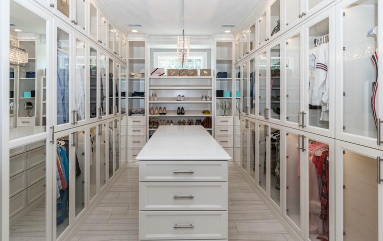
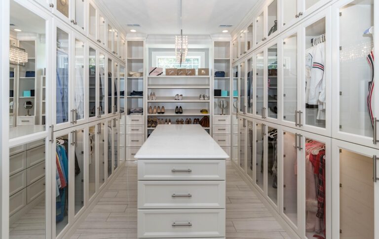
Walk-In Closet Colors: Choosing the Right Palette for Your Space
“`html
Introduction
Choosing the right walk-in closet colors seems simple enough. Then you’re standing in the paint aisle, staring at a hundred shades of white, and it hits you — this is harder than it looks. I’ve been through this a few times, both in my own place and helping friends with their renovations. What I’ve found is the color you pick does more than change the look. It changes how the space feels. It changes how your clothes look under the lights. It even changes how often you actually want to stand in there and get ready. This guide breaks down practical color schemes, how lighting plays into it, and the mistakes I’ve seen people make — including myself. This isn’t about chasing trends. It’s about making a choice that works for your space and still feels right years later.

Why Color Matters in a Walk-In Closet
Color in a walk-in closet isn’t just about looks — it’s functional. The right shade can make a small room feel bigger, set a calm tone for your morning routine, and affect how accurately you see your clothing and makeup colors. I learned this the hard way. Early on, I painted a small closet a deep navy blue. Looked incredible in the sample photo online. In reality, it felt like a cave. Every time I walked in, I felt boxed in, and my darker clothes seemed to disappear against the walls.
Dark colors do have their place though. They can make a large closet feel intimate and luxurious, like a boutique dressing room. But that luxury comes with a tradeoff — you need a lot more lighting to avoid a gloomy feel. Light colors, on the other hand, bounce light around and make a space feel open and airy. They also make it easier to see your clothes’ true colors. The choice isn’t just about preference — it’s about understanding your room’s dimensions and how you actually use the space every day.
The Three Most Common Walk-In Closet Color Palettes
After spending time in a fair number of closets, I’ve seen three palette categories that consistently work. Each has its own strengths and best use cases. None is universally better than the others. Understanding the tradeoffs helps you figure out which one fits your situation.
Neutral Light: White, Beige, Light Gray
This is the default for good reason. Light gray, in particular, is a workhorse. It hides dust better than white, doesn’t mess with your clothing colors, and creates a clean backdrop that works with any style of cabinetry or hardware. Beige is warmer and can make the space feel cozier, but it can clash with cool-toned accessories or floors. White is classic, but it shows every speck of dust, so be ready to clean more often. If you’re going with a light neutral, a quality paint can make a real difference in coverage and finish.
Best for: Small rooms, low ceilings, or anyone who wants maximum versatility.
Neutral Dark: Charcoal, Navy, Deep Green
These colors add drama and a sense of luxury. A charcoal wall makes a large closet feel like a private boutique. But here’s the thing — they demand good lighting. Without multiple light sources, these colors will make the room feel smaller and darker. I once used a deep forest green in a closet with only one overhead light. I ended up adding under-shelf LED strips to make it usable. If you go with a dark color, plan on adding adjustable lighting fixtures to keep the space functional.
Best for: Large closets, walk-in rooms over 8×10, or spaces with good natural light.
Warm Tones: Cream, Taupe, Soft Blush
Warm tones are popular, but they have a specific place. Cream and taupe work well in closets with warm wood cabinetry or brass hardware. They create an inviting atmosphere. Soft blush is more niche — it works if you have a specific aesthetic, but it can be tricky to coordinate with your clothing colors. A mistake I see is people picking a warm tone that clashes with their skin tone or wardrobe colors, making the room feel off.
Best for: Closets with natural wood elements, or for creating a calm, relaxed vibe.
| Palette | Best Use | Lighting Need | Risk |
|---|---|---|---|
| Light Neutrals | Small or low-light closets | Low to moderate | Shows dust quickly |
| Dark Neutrals | Large, well-lit spaces | High (multiple sources) | Can feel cramped |
| Warm Tones | Aesthetic-driven designs | Moderate | May clash with wardrobe |
How Lighting Affects Your Color Choice
Lighting is the most overlooked factor in choosing walk-in closet colors. I’ve seen people pick a beautiful shade in the store, only to find it looks completely different under their closet’s lights. The reason is straightforward: paint color changes depending on the light source. Warm bulbs (2700K) will make cool colors look dull. Cool bulbs (4000K) can wash out warm tones.

Most walk-in closets don’t have windows, so you’re entirely dependent on artificial lighting. That means you have a choice — you can either choose your color and then find bulbs that complement it, or you can pick your lighting first and then select a paint color that works with it. I recommend the latter if you’re starting from scratch. A good rule of thumb is to test your paint color with the actual bulbs you plan to use. Paint a large sample board and leave it in the closet for a couple of days, checking at different times. If natural light is involved, check at morning, noon, and evening. What looks like a pale gray at noon can look drab and muddy under artificial light at night.
If you’re using LED strips or spotlights, pay attention to the color rendering index (CRI). A high CRI (90+) will show colors accurately, which matters when you’re trying to match an outfit. Cheap bulbs with low CRI can make everything look flat and dull. If you need bulbs with a high CRI, looking for LED light bulbs with a CRI rating of 90 or above is a practical step to take.

Paint Finishes: Matte, Eggshell, or Semi-Gloss?
The finish matters as much as the color. In a closet, durability and cleanability are key. Here’s what I’ve found works best through trial and error.
Eggshell is my go-to for walls. It hides minor imperfections (like drywall seams or texture) while being wipeable enough to handle the occasional scuff from hanging clothes or moving hangers. It’s a middle ground in terms of sheen — not too flat, not too shiny.
Matte looks expensive and hides flaws well, but it’s harder to clean. If you touch the wall with a dirty hand, you’ll see the mark, and cleaning can leave a noticeable spot. I only recommend matte for closets with low traffic, like a secondary walk-in that doesn’t see daily use.
Semi-gloss is essential for trim, doors, and shelving. It’s durable, easy to wipe down, and stands up to repeated contact. I’ve used it for accent walls in a few closets, but it shows every imperfection in the drywall, so it’s not ideal for large wall areas unless the surface is perfectly smooth.
A practical combination: flat or matte on the ceiling (hides shadows), eggshell on walls, and semi-gloss on trim and shelving. This gives you the best balance of aesthetics and durability. To get the job done efficiently, a good set of painting supplies can help achieve a professional-looking finish.
Common Mistakes When Choosing Closet Colors
I’ve made most of these mistakes myself, and I see them online all the time. Here are the ones that cost you time, money, and frustration.
Choosing a Trendy Color Without Thinking Long-Term
Trends like millennial pink or bold jewel tones look great in curated photos but can feel dated within a few years. You’re painting a room that should last a decade or more. Stick with colors that have proven longevity. If you want to inject trend, use accessories or a removable wallpaper accent wall.
Ignoring the Ceiling
The ceiling is often forgotten. In a small closet, a dark ceiling makes the room feel lower and more closed in. Keep the ceiling white or a lighter shade than the walls. For a larger closet, you can be more adventurous, but white still tends to look better because it reflects light downward.
Not Testing With Your Actual Lighting
I already mentioned this, but it’s worth repeating. A sample card is not enough. Paint a 2×2 foot board and look at it under the specific bulbs you plan to use. This one step has saved me from painting an entire room the wrong color.
Matching Wall Color to Your Clothes
You’d be surprised how many people choose a wall color that matches their go-to clothing colors. This makes it harder to visually distinguish clothes from the background. For example, if you wear a lot of navy, don’t paint the walls navy. You want contrast so your wardrobe stands out.
Color Schemes for Small vs. Large Walk-In Closets
The size of your closet should guide your color strategy. A color that works in a spacious 10×12 room can make a 5×5 closet feel like a hallway.
Small Closets (Under 6×6 Feet)
Light and cool is the way to go. Pale gray, soft white, or light blue-gray are solid choices. These colors reflect light and make the space feel larger. Avoid dark colors entirely — they will visually shrink the space and make it feel cramped. Also avoid warm tones on walls; they can make the room feel smaller and stuffy. If you want warmth, use it in the carpet or fixtures.
Ceiling: Keep it white or a lighter shade than the walls. Dark ceilings in small rooms are a mistake.
Large Closets (Over 8×10 Feet)
Here, you have room to experiment. Darker colors like charcoal, navy, or deep taupe add sophistication and create a distinct atmosphere. But even in large spaces, consider the ceiling. If the ceiling is over 9 feet, you can paint it a darker color for a cozier feel. If it’s standard height (8 feet), keep it light to avoid a lowering effect.
Scenario: In a 10×12 closet with a high ceiling, I painted the walls a rich slate blue and the ceiling a lighter white-gray. It felt like a luxury boutique without being overpowering.
Using Accent Walls and Two-Tone Schemes
Accent walls are an effective way to add visual interest without committing to a bold color everywhere. In a walk-in closet, the best place for an accent wall is the far end, opposite the entrance. This creates depth and draws your eye into the room, making it feel longer. I’ve used a deep navy accent wall against light gray walls with good results.
Two-tone schemes work well for adding perceived height. Paint the lower two-thirds of the wall a darker color and the upper third a lighter color. This makes the ceiling feel taller. A tried-and-true combo is Benjamin Moore’s ‘Dove Wing’ (light warm white) on top and ‘Chelsea Gray’ (mid-tone gray) on the bottom. This works especially well in closets with crown molding or a chair rail.
If you’re unsure, start with an accent wall. You get the impact of a different color without the risk of painting the entire room and hating it.
Coordinating Closet Colors With the Bedroom
The walk-in closet is usually connected to the master bedroom, so they should feel like they belong together. That doesn’t mean they need to match exactly. A lighter version of the bedroom color is a safe bet. If your bedroom is a warm taupe, try a lighter beige or cream for the closet. This creates a smooth visual transition when you open the door.
Sometimes, a contrast works well. A bold closet color can feel like a pleasant surprise — a moment of discovery when you open the door. If your bedroom is neutral beige, a closet in a muted sage green can feel fresh and intentional. However, this approach works best if the contrasting color still complements the bedroom’s undertones. Beige and sage both have green undertones, so they pair naturally. Beige and cool gray, however, might clash.
Rule of thumb: Keep the closet within two shades of the bedroom, or choose a complementary color that shares an undertone. Avoid reds or yellows that don’t appear anywhere else in the bedroom.
Tools and Products to Help You Choose
Getting the color right requires the right tools. Here are the ones that make the process easier and more accurate.
Samplize Peel-and-Stick Samples — These are a game changer. Instead of painting a patch on the wall and having to repaint it later, you get a large, removable sticker that shows the true color on your wall. No mess, no cleanup. You can move it around to see how it looks in different parts of the closet. Browse paint sample options on Amazon.
Adjustable LED Lighting Kit — A lighting setup with adjustable color temperature lets you test the same paint sample under warm (2700K) and cool (4000K) light. This is invaluable for making a final decision. See adjustable lighting kits on Amazon.
Color Wheel — A simple tool to help you understand which colors complement each other, especially if you’re doing a two-tone scheme. It’s a low-cost way to make sure your choices work before you buy paint.
Paint Sprayer — If you’re painting shelving or trim, a sprayer gives a more even finish than brush and roller. It’s worth the investment if you have a lot of shelving. Explore paint sprayers on Amazon.

Final Checklist for Choosing Your Closet Color
Before you start painting, run through this checklist to avoid costly mistakes.
- Assess your light. Is there natural light? What temperature are your bulbs? Test with the actual lighting you’ll use.
- Determine closet size. Light and cool for small spaces. Dark and bold only in large rooms with good light.
- Test on the wall. Use sample boards or peel-and-stick samples. Don’t rely on a tiny paint chip.
- Choose your finish. Eggshell for walls, semi-gloss for trim and shelving.
- Coordinate with the bedroom. A comfortable transition, not a hard contrast.
- Think long-term. Avoid trendy colors that will look dated in five years.
The best walk-in closet color is the one that looks good in your space, under your lights, and with your wardrobe. Take your time, test thoroughly, and don’t be afraid to start over if the first choice doesn’t feel right. If you’re ready to start, grab a sample pot and test today.
“`